Friday 31 May 2013

Art Auction: The Colonized #1

The Colonized #1 (IDW, April 2012)
Art by Dave Sim
Sold: $450 (+19.5% BP)
DAVE SIM:
Chris [Ryall, IDW Editor-In-Chief] said that he was doing a creator-owned 4-issue mini-series called THE COLONIZED and was I interested in doing the covers? He described Drew Moss' designs as "a kind of '50s Wally Wood sci-fi aesthetic... in brief, aliens and zombies and militia men... I always like something that can be a good representation of the series, since the image often has to function as both an ad for the series and also the eventual trade paperback design... I envision a big, bold 1950s blocky "IT CAME FROM OUTER SPACE!" sort of treatment that clues people in to the tone of this (it's largely played straight, not for laughs). And he offered me 50% of my cover rate if I would draw the logo. Read the full article here...

Thursday 30 May 2013

The Albatross

Cerebus #45 (January 1983)
Art by Dave Sim 
(Click image to enlarge)
DAVE SIM:
(from Cerebuswiki)
[The Albatross] is the most formidable power object in the known universe: a wildly improbable plot device. Like The Maltese Falcon only more politically formidable. In a Real World context, I called my notebooks my Albatrosses because I was as saddled with them much like Coleridge's Ancient Mariner. So I was declaring in a way -- by making the albatross statue that significant in High Society -- that I was ambitious enough to want to do something of remarkable significance with all the half-witted notions and half-baked philosophies I was sketching out and jotting down in my own "albatrosses". "Invoke often", is the first rule of the sort of mysticism that one finds in used paperbacks in 5 for a dollar bins. Unless one is in a New Age bookstore, in which case one can pay 50 dollars to be told the same thing between hemp-derived hard covers.
Cerebus #90 (September 1986)
Art by Dave Sim & Gerhard

Wednesday 29 May 2013

What If Gerhard Had Worked On Cerebus From The Beginning?

Following Cerebus #4 (May 2005)
Art by Dave Sim & Gerhard
DAVE SIM:
(from Following Cerebus #4, May 2005)
This issue's illustration is the first in a series of 'Wouldn't It Have Been Great If Gerhard Had Worked On Cerebus From The Beginning?' covers. This one is based on panel one of page 234 of the Cerebus volume (or page 6 of issue 11, if you prefer). My attempt at the time to convey the rooftops of Paris at the time of the Revolution ended up looking -- with the balcony running the width of the second building and the dormer windows occupying most of the face of the same building -- like an upscale subdivision of Swiss ski chalets. Gerhard smooshed the buildings together, shortened the elevation of the roofs, lowered the perspective to establish the density of the streetscape, and made all the windows appropriate sizes. Since all I had to do was to draw Cerebus and the Roach, I decided to solve one of the other problems from the original picture -- the impression that the buildings were set on a wide boulevard -- by drawing my own foreground building. The delineation of the bricks, the cartoon birds huddled in their nest, the "negative space" compositional use of snow, the books visible on the shelf through the window, the battered drainpipe: each element was consciously or unconsciously influenced by the Will Eisner studio look of the late 1940s. That seemed to me sufficient reason to retain the picture when this, unexpectedly and sadly, became the Will Eisner Tribute Issue.
Cerebus #11 (August 1979)
Art by Dave Sim

Tuesday 28 May 2013

IDW Covers: DR Who - Prisoners Of Time #8

Doctor Who: Prisoners Of Time #8 (IDW, August 2013)
Art by Dave Sim
DAVE SIM:
This was in the "happy accident" category. The DR. WHO covers are done from official BBC publicity stills they've supplied to IDW. Basically what I would do is just click on each one for that issue's Doctor and then drag an image that showed potential onto my desktop. Usually: does this look like an Al Williamson drawing? In the case of Doctor #8, who has more of a Gothic look about him, I thought I'd look for a good Bernie Wrightson shot. It wasn't much of a contest. I liked this one. But I hadn't noticed it was a horizontal, rather than vertical photo (the vertical ones tended to fit perfectly in the available illustration space beneath the logo). So I tried to enlarge the print-out to 11x17 on the office photocopier but the photocopier was having a bad day. It's over 20 years old so it has more bad days than good days. Anyway, the printed image was too dark to see anything. But I was really stuck on this particular photo. So I decided to see, okay, how much space DOES it take up? And it took up a fair amount of space with all the excess space at the bottom once I had the Tardis "peaking" at the top of the cover. And that was when I got the idea of doing multiple images -- basically doing a relatively finished tight pencil on the primary image and then enlarging that 120% or so and tracing THAT off and then enlarging that 120% or so and tucking that in at the bottom. Which gave it a really good illustrative "Prisoner Of Time" look, I thought. Then it was really a matter of careful inking to make sure that I didn't lose the illustrative quality. This one's tied with THE COLONIZED #2 cover for my favourite IDW cover I've done so far so you might NOT see this one auctioned.

Monday 27 May 2013

365 Days Of Cerebus: Church & State Vol II

Cerebus #111 (June 1988)
Art by Dave Sim & Gerhard
MATTHEW MAYLIKHOV:
(from 365 Day Of Cerebus: Part 4, posted at Multiversity Comics, 10 May 2013)
...this book is just an absolute triumph of artistic expression, both figuratively and literally. On the one hand, the book is beautiful and dark in the same way that Moore and Williams III’s Promethea was, an exploration of religion that shines a greater light towards the negative and uses the central idea as a device in which to discover a person’s capabilities. Cerebus' actions, and those around him, are so fueled by religious doctrine that Cerebus is ultimately forced to embrace it in a rather unexpected way, and it inherently backfires on him, all to Sim's plan. Here Sim uses Cerebus as a figurehead for some of his thoughts on religious organizations and entities, but he never strays too far into a place where he's inherently bashing the reader over the head with his own beliefs. Instead, he mixes it up by both showing the inherently negative aspect to organized religion while also offering up a brand new set of mythology, a brand new religious ideology within the Cerebus universe. It's beautiful but crushing in its mix of optimism and pessimism, drawing the reader in but ultimately knocking them down along with Cerebus who, due to his selfish nature, ends this story on such a low point that the epilogue story contained within Cerebus Zero is essentially a silent issue of Cerebus debating suicide. So that’s fun.

...It’s interesting to see how many risks are taken throughout the narrative in terms of storytelling decisions, because whether we're looking at the issue told from first-person perspective or that of Cerebus' climb in which tall and thin horizontal panels are placed next to one another to show off moments in rapid-fire succession, Sim continues to be an incredibly intuitive and creative storyteller in a way that many modern comic creators don’t seem to be able to match.

...Sitting down and reading it in a few afternoons was probably one of the most rewarding experiences I have had in comics since I started reading comics.

Sunday 26 May 2013

A Glamourpuss-ectomy


Originally serialised within the pages of the self-published Glamourpuss #1-26 (April 2008 to July 2012), The Strange Death Of Alex Raymond is an as yet uncompleted work-in-progress in which Dave Sim investigates the history of photorealism in comics and specifically focuses on the work of comic-strip artist Alex Raymond and the circumstances of his death on 6 September 1956 at the wheel of fellow artist Stan Drake's Corvette at the age of 46.

DAVE SIM:
(from the Kickstarter Update #159, 20 May 2013)
...If you recall, this is my month for working flat-out on THE STRANGE DEATH OF ALEX RAYMOND and that's what I've been doing.  As of right now, I've got the cover for the first issue done, the inside front cover, pages 1 through 4 (new framing sequence) and I'm just now working on new pages 10 and 11.  If you have a copy of glamourpuss No.1, you can see the logistical problem by reading it.  How do I do a complete or near-complete "glamourpuss-ectomy" while leaving the History of Photorealism stuff intact?  Where's the best place to "break" for "continued next issue"?

I've decided on a near-complete as opposed to complete "glamourpuss-ectomy" since a first issue is a very different thing from a book collection which is what I started working on, mentally.  I finished page 10 this morning and knew right away EXACTLY what I wanted page 11 to look like and got that roughed in in about an hour.  GOOD sign. I think the first 11 pages read VERY smoothly now.  On the new material I'm trying to do more actual comics page narrative (which was a big complaint on glamourpuss from the beginning) and trying to figure out the best way to do that. I'm definitely getting faster.  I actually did almost ALL of page 4 in one day which I haven't been able to do for years.  Of course then it took me a little over 3 days to do page 10 -- and now I have to double back and put a more elaborate background on page 2, but I do think I'm getting this figured out.  A first issue is really all about HOW you're going to do this -- what the overall structure and look is.  Once I've got that -- and I think I'm getting that -- then it's a matter of staying locked onto that concept as a form of comics sonar.
Glamourpuss #1 (April 2008)
Art by Dave Sim
Then I have to figure out what the back of the book is going to look like and designing that.  Then at the end of the month, I have to e-mail the whole thing to IDW and get a reaction from Ted Adams and Chris Ryall, the editor-in-chief.

They've both been VERY supportive. Escape Pod Comics which is "tapped in" here read my comments a while back that I think the book needs to be in colour and me (not remembering this is the INTERNET! DUH!!!) I find out -- because Menachem faxed me -- Menachem has latched onto the IDW Twitter feed and is saying HE thinks the book should be in black and white and, you know Ted Adams HIS OWN SELF gets dragged into it. And he says HE tweets that he thinks the book should be in black-and-white (and is, I'm sure, wondering Why am I hearing this from a RETAILER instead of DAVE?). And Menachem tweets "So why does Dave say it should be in colour?" and Ted goes, "Well, we'll do whatever Dave wants."

That's VERY supportive. Unheard-of supportive, to me.

Anyone is welcome to "leak" anything I say here, but, believe me, nothing is carved in stone which is why I haven't started having any NUMBER of discussions with IDW yet.  I want to show them what I have at the end of the month and let them know all the things that I'm wondering about and theorizing about -- colour being one of them.  And I definitely want THEIR unvarnished perspective.  I'm completely out of step with comics today and they're both very much IN THE TRENCHES on a daily basis.  The last thing I need is them tip-toeing around any imagined sensitivities on my part while thinking "This isn't going to work like this, but how do we tell DAVE SIM that?"

By TELLING him.  That's why the book isn't scheduled and won't be for at least a year if not two.  I want to get this right.  And if that means starting over, that means starting over.  I'm sure IDW welcomes anyone's feedback who is interested in the project.  But it's WAY at the beginning.  I'm bringing all of YOU in on it to a degree because you are DEFINITELY the core target audience -- the ones most apt to actually go into a store and ASK for this book when it gets there.  So I want you to know that it IS being worked on on an on-going basis and where I am.  There is a real danger to everyone saying, "That's fine -- you just...DO IT...and I'll be right here ready to buy it." But if you don't go into comics stores regularly -- and a LOT of you don't go into comics stores regularly -- a year or two is an ETERNITY in the 21st century.  The odds of you even hearing that first issue is solicited drop to almost nothing in that scenario.  It's going to be one of the biggest challenges for me WITH IDW SUPPORTING ME WITH ALL THEIR RESOURCES which they've made clear is what they're planning, to figure out how to maintain interest in a book still being worked on for a period of a couple of years.  Chris wondered if they could get artwork for San Diego.  And uhhhhhh emmmm.  I don't KNOW. The danger there is being old news at the 2014 San Diego. "Hasn't that come out YET?"  Well, no. A year or two. I said that from the beginning. THAT won't register.  "That Sim. One cover a year and a couple of panels. What a schmuck."

What I'm HOPING is if I can say "Three issues in the can."  Then "four issues in the can". And sign an affidavit if necessary or have Ted and Chris swear on a stack of LOCK & KEY hardcovers (so you'd KNOW they were, like, serious, eh?).  Well, okay -- you can take THAT to this year's San Diego.

And YOU will all hear it here first: how many issues are "in the can".  Right now, almost one. I think. Subject to change.
Glamourpuss #1 (April 2008)
Art by Dave Sim
I'm really trying to be as transparent as possible. My theory is that if I say anything newsworthy (or, rather, "newsworthy") here, the news sites will pick it up.  Rich Johnston (Hi, Rich!) runs a lot of stuff at BLEEDING COOL and as far as I can determine that's where news sites see my stuff and decide if it's news.  But there is a very narrow definition of "Dave Sim" and "news".  My IDW variant covers are "news" to a degree.  People see them and seem to like them, which is good.  That's a big reason I'm doing them, now.  At first, I didn't think anyone would even notice any more than they notice anything else I do. IDW has really been playing them up big in PREVIEWS which I take as a vote of confidence.  The news sites (some of them) are running them from what I hear.  They're a LOT more relaxing than THE STRANGE DEATH OF ALEX RAYMOND. So that's why I'm not JUST doing STRANGE DEATH.  I need a break every once in a while.  Win, lose or draw a cover is done in a day or two and that's it.  It's not part of this 300-page bridge I'm trying to build from both ends.  Eddie faxed me some new material and that always gets me fired up. "Oh, I HAVE to do this now! LOOK at that!" 
Glamourpuss #1 (April 2008)
Art by Dave Sim

Saturday 25 May 2013

Cerebus: In My Life - Joseph Alberts

Joseph Alberts (AKA 'James Sorrell', 'J.M. Matthews' and 'Spindack') has been publishing his own comics online at Webcomics Nation for over 5 years. When not working as an online publisher and broadcaster, Joseph is busy compiling a manuscript for The Parallax Notes, to be a self-published book collecting his writing and art work from over the last 10 years. Visit his Amazon Store here.
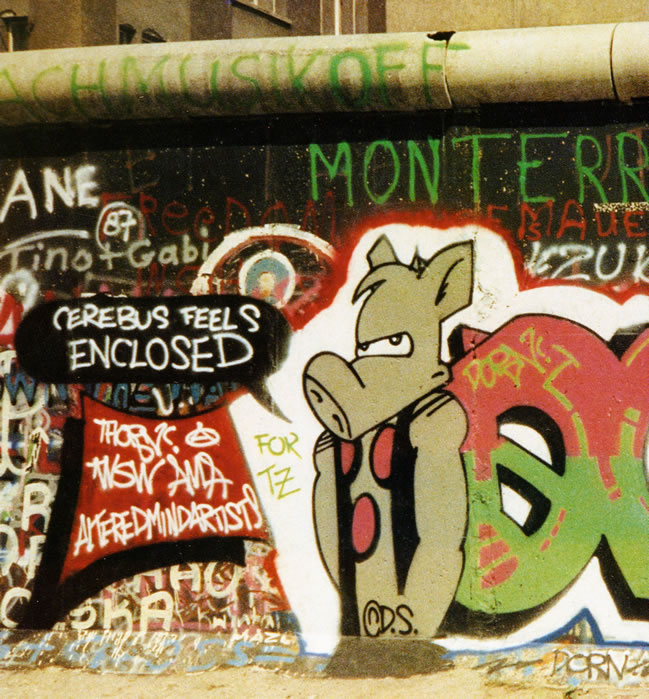

LIFE AFTER CEREBUS

There's something truthful about Dave Sim and the path he's chosen on his career. His honesty, how when he says something, and he's going to achieve something, despite a mountain of doubt and oppositions, haters, and critics, he still somehow proves himself right by doing exactly what he said: Draw 300 20-page issues about a sword and sandal aardvark and his assort adventures and mishaps, whose story ended up being one of the longest, most epic narratives told by anyone, let alone Dave Sim, sitting pretty at about 6,000 pages long.

Dave Sim channelled both his youthful anger and masculine philosophy into one tasty high fantasy action-adventure, dramatic offering of a meal of a comic book series. One that seems to go on well beyond forever, and that's been around longer than most independent and self-published comics. It stands as one of the oldest black and white independent comic books of all time, if not also one of the most famous and commercially successful. It is a book series that is both classical and progressive at the same time, something very uncommon for the era it was born out of. You don't find comics as original, literary, creative, unique and visionary as Dave Sim's just everyday.

All of these things and more are why I always loved the work of Dave Sim. Even when the whole world seemed like it wanted to overpower him and force him to back down, back down from expressing the honest truth of what he is in literary and visual form, even when most others wanted him to back down, he never did. Confidence like that takes guts. It takes courage and a lot of energy.

Whenever I hit a brick wall in my own comics work, I often find myself drawn to thumbing through copies I own of the Cerebus phonebook collection for inspiration. They have a heftiness to them, most of them, that is hard to mistake with other books.

The Cerebus Guide to Self-Publishing also helped me find inspiration a lot of the time too. Dave Sim is a Master Builder of the comics and sequential art variety, no doubt about that, but I have no clue how future posterity will react to a man of the calibre of Dave Sim. But I imagine teenagers of future generations just like myself will also find similar literary inspiration in Dave Sim's work.

Shine on, Dave Sim.

Shine on.


Friday 17 May 2013

Gone Fishing

Cerebus #211 (October 1996)
Art by Dave Sim & Gerhard

'A Moment Of Cerebus' will return 26 May 2013.

Thursday 16 May 2013

Happy 57th Birthday, Dave Sim!

(Click image to enlarge)
DAVE SIM:
(from Aardvark Comment, Cerebus #39, June 1982)
Photograph used in Kitchener-Waterloo Record in a story about forged Cerebus #1s. That's an authentic one that I'm holding by the way. Wave to Deni behind the door. Hi Deni.

Wednesday 15 May 2013

Photorealism: "Run Your Own Race"

Glamourpuss #20 (July 2011)
Art by Dave Sim
DAVE SIM:
(from the 100 Hours Tour: TCJ, 15 February 2008)
...although I don't share all of Alex Ross's political viewpoints -- nor he, mine I'm sure -- I think he probably hit a very high watermark, possibly the highest watermark, in the idealistic FDR and (particularly) Eleanor Roosevelt Liberal political tradition which is the metaphorical nutrient soil in which the comics industry is founded with SUPERMAN PEACE ON EARTH. I think you'd have to be pretty cynical and jaded (a completely protected free will choice) to see that story in particular as just grown men in leotards.

I am loathe to criticize anyone whose work I can't do and Alex Ross is definitely in that category. I can look at it and see WHAT IT is that he's doing and particularly in his tabloid books and MYTHOGRAPHY book of his DC work, I can see HOW it is that he's doing it. But I can't do it and I freely admit that I can't do it. He is at a much, much higher plateau of the Leonardo dictum that "painting is seeing". If you can see clearly and break the image down into a series of colour problems, a series of layers of decision-making, colour density, dilution of colour, brightness of colour then you are UP THERE. I'm not. Far from embarrassment or emptiness my reaction is one of awe and admiration...

Yes, it's one of those molar-grinding qualities of the Neal Adamses and the Alex Rosses of this world: the rock-solid knowledge that if THEY decide to do what YOU'RE doing they're instantly going to be better at it than you are. If Alex Ross sits down tomorrow and says, "Hmm a fashion magazine parody drawn in Alex Raymond's various RIP KIRBY styles. Hmm. I haven't done any black-and-white stuff for the most part, let's see what that's like" his version will BURY mine six ways to Sunday.

That's part of the realism mountain. If you're in the game you have a pretty good idea of where you are (Way Way Down Here in my case). You put your blinders on and "run your own race" (as Danny Thomas reportedly counselled his daughter Marlo). I want to make it up to the next base camp and that's all I'm focused on.

Tuesday 14 May 2013

Photorealism: "It's A High Wire Act"

Glamourpuss #13 (May 2010)
Art by Dave Sim

DAVE SIM:
(from the 100 Hours Tour: TCJ, 31 January 2008)
Photorealism is a high wire act. Raymond, according to his long-time assistant (in Tom Roberts' new book) used to spend three days penciling a week of dailies and a day and a half inking them. It's very difficult to sit there and work on every little detail of the face and the eyes, labouring over it to get it right. There's the photo, there's the face. Erase and draw, erase and draw, erase and draw. And then when it comes time to ink you have to just go in splish splash swoop slash. Otherwise it doesn't look right -- it doesn't look as if Al Williamson did it. It's too tight, too laboured over. That's where the thin brush comes in. Deep breath and swoop using your whole arm, no time to stop and think. 100% confidence or as close to 100% as you can get. That's why you need to work on a strip for years before you genuinely develop that confidence. I'm using too many lines for classic Raymond School but I've only done 30 pages. You have to do 100s of strips to actually develop the confidence. Hal Foster admitted that he envied Raymond's brush line and admitted he couldn't get to that level. Considering the time Foster put into learning to draw that's quite an admission.

Monday 13 May 2013

Photorealism: "It's Just Photograph Tracing"

Glamourpuss #13 (May 2010)
Art by Dave Sim
DAVE SIM:
(from the 100 Hours Tour: Comicon, 1 February 2008)
You know I was telling Chester Brown on one of my visits last year that I wish I was an inventor because it seems to me that all of the elements are in place to do photorealism more efficiently. I should be able to take digital images with a digital camera, download them into a combination computer and light table and trace them from there. The problem comes in with the pixilation. The image looks sharp -- as do the photocopies -- until you actually try to trace it and then you find that the contour isn't actually there, it's gradated. And the gradation is broken down into pixels and it's anyone's guess where the actual edge of the shadow is. That's why it takes so long to pencil a photorealistic image. Tracing makes it sound as if it's all there and it's as easy as tracing the Coca Cola logo or something. We are talking about really, really, really nuanced realities being turned into single pen or brush strokes. That's where you see the genius of Williamson. Two pen strokes barely a micron wide but they're the RIGHT two pen strokes. A micron to the left or right and the girl looks as if she has a black eye or a dislocated cheek. Any form of cartooning outside of photorealism there is so much latitude as to where the line goes that it's just about effortless by comparison. 

In my own case, being called a photograph tracer comes very low on the list of negative things that I've been called so (like everything else I've been called) it really doesn't have any impact. It's just an opinion. Everyone besides me seems to be deathly afraid of being accused of tracing anything. After 6,000 pages and 26 years of worrying about things like that, I decided to just do what interested me and that's photorealism. If it's so easy, why isn't the field full of people "banging out" Al Williamson pages at a 5-a-day clip? No, to me translating a photo into a good comic book page or panel is the ultimate highwire act. One slip and bye-bye picture.

Sunday 12 May 2013

Photorealism: "It's S**t"

Glamourpuss #16 (November 2010)
Art by Dave Sim
DAVE SIM:
(from the 100 Hour Tour: Comics Village, 21 February 2008)
Long story short, I think that we have to get used to the fact that there does tend to be an adversarial relationship in comics between the "cartoony" and "realism" factions...

You know even back in 1994 when I MC'ed the Harvey Awards in Dallas in the years when Al Williamson was winning the Best Inker award every year for his work on DAREDEVIL over John Romita Jr., it was amazing the number of people who ONLY knew him from that work. But that's very much the nature of the environment is the unpredictability of it and the extent to which one individual can suddenly change everything -- so suddenly and so dramatically -- that you don't even notice until it's a fait accompli. The comic-book field was built, in large part, on the foundations of Hal Foster, Alex Raymond and Milt Caniff. Just about every big name in the Golden Age of comic books could be charted directly to one of those three Schools (Joe Shuster "doing" Raymond, Bob Kane "doing" Caniff, Shelly Moldoff "doing" all three, as Jules Feiffer pointed out, often in the same story). In the National Cartoonist Society it was the same. The big foot strips were really just "filler" between the jaw-dropping full page glory of Jungle Jim/Flash Gordon, Prince Valiant and Terry and the Pirates.

The reduction in size of the strips coupled with the appearance and exponential rise of the success of PEANUTS just... eliminated... the high-end guys. Stan Drake spent the last few years of his life drawing Blondie, Leonard Starr was tapped to revive Little Orphan Annie and so on...

Anyway, the problem with that is that the discussion just moves away from realism and everyone acts as if realism is inherently bad comics. And as tends to happen when these illusory consensus views take shape you find yourself being carried along with it. Oh, yeah Todd McFarlane -- MUCH better than Art Adams. Whoah, whoah, whoah. But the longer no one says anything the more the entire field slides in the other direction. I was lucky enough to be in the situation where I knew the vocal elite was going to dump on whatever I did next no matter what I did so, hey, let's go back and try something Incredibly Difficult and Challenging but Also Fun -- let's "do" or more to the point DO Alex Raymond, Stan Drake, Al Williamson.

What's odd is that it is starting to seem like I'm very far from being as alone in that as I thought I was -- a lot of guys my age are starting to go back to Mike Kaluta, Berni Wrightson, Al Williamson, Neal Adams and so on out of personal preference. Dark Horse is bringing out the CREEPY ARCHIVES, the ALEX RAYMOND book is selling well. Bryan Hitch is at the top of the WIZARD Top Ten list this month.

The vocal elite in indy comics is reacting predictably -- photorealism is s--t -- but that doesn't mean that we can't investigate if that's just them or if that's an actual consensus in the field. I suspect it's just them and that there's still a great deal to be said in trying to be as "true to life" as those of us who are interested in "true to life" choose to attempt.

Sorry I got a little long-winded there, but it seems to me that's part of the problem I'm facing and that people who share my preferences are facing. It's not just talking about what I consider the best work in comics, it's identifying how it went from the center of the field to the margins of the field and why that doesn't seem to be a particularly valid "truth" to adhere to. People will call you crazy for liking realistic artwork but, hey, don't worry about it. Those people call anyone crazy -- or s--t -- who doesn't share their preferences. That doesn't mean that you're crazy -- or s--t -- in my opinion. If you think it's the best stuff, for you it is. Changing your opinions to conform to those of a self-declared elite seems really silly to me. Life's too short.

Saturday 11 May 2013

The Advance Game


Originally serialised within the pages of the self-published Glamourpuss #1-26 (April 2008 to July 2012), The Strange Death Of Alex Raymond is an as yet uncompleted work-in-progress in which Dave Sim investigates the history of photorealism in comics and specifically focuses on the work of comic-strip artist Alex Raymond and the circumstances of his death on 6 September 1956 at the wheel of fellow artist Stan Drake's Corvette at the age of 46.

DAVE SIM:
(from the Kickstater Update #158, 9 May 2013)
...And I have to say that I really appreciate the donations to the Dave Sim Fund which are staying pretty steady.  Which is a good thing because the printing of the restored CEREBUS and HIGH SOCIETY volumes -- Aardvark-Vanaheim's "bread and butter" books -- has been telescoping like crazy. Problems with the second set of CEREBUS proofs not including all previous corrections meant that we took a giant step backward, but we are now (or will be in the next couple of days) into Round Two of the proofing stage.  But that pushed HIGH SOCIETY back by a couple of weeks. I finally had to tell my Diamond rep to just forget about HIGH SOCIETY for the moment (Diamond wants five weeks to get the word out to the retailers) and I'd let him know when we were closer to a print date.

Meanwhile, I decided not to do any IDW covers this month so I could devote all of May (well, except for the three All-Day Kickstarter days, of which this is one) to actually producing THE STRANGE DEATH OF ALEX RAYMOND pages for the monthly serialization through IDW. So, updating all of you on that, I finally ordered a magnifying lamp for my drawing board and it REALLY works well.  I mean, I spent the first day doing a panel on the inside front cover of THE STRANGE DEATH OF ALEX RAYMOND #1.  That's where IDW runs their credits, so I thought I'd start the story there and scatter the credits over the first two or three pages.  I spent a LOT of time checking what my ink line looked like under the magnifier and then checking what it looked like on the actual page.  And I was inking PAINFULLY slowly, trying not to make any mistakes.  By the second day, I had loosened up considerably on page one and then suddenly I SAW the Stan Drake figure I was inking --  actually his left arm -- through my Al Williamson eyes.  And, of course, Williamson's style is really based on microscopically thin lines and solid blacks.  Which I was now capable of doing because I was inking lines that were half the size they appeared to be.  "Oh, I GET this, I understand this!"  It didn't last long but it was pretty amazing when it was happening.  It's also helped me with my "finish" -- squaring my corners and making sure my solid areas of black are solid instead of having white specks and streaks in them.  It comes and goes, but overall the effect is pretty good. A big step up in the photorealist scheme of things.
Glamourpuss #16 (November 2010)
Art by Dave Sim
Anyway, the idea is to see how much of a single issue I can get done in a month.  #1 doesn't really count because I have to design the logo, the look of the cover, the typography and the "titles" in the inside front cover.  I thought I'd never be done with those.  On #2 I won't have to do that again. Which is the reason I wanted to take all of May to try and get #1 done and maybe some of #2...

...Basically what I want to do is avoid the "advance game", where you get a large sum of money for a finished work and then have to finish it.  But long before you finish it, the advance is gone, so then you have to find other paying work to do while you're finishing the work you already got paid for.  I used to give Bissette a hard time about that, and now I'm going through it  (he thinks he's landed in some weird parallel universe where Dave Sim does work-made-for-hire covers).  Basically the idea of the Dave Sim Fund and doing the IDW covers is to get me to the point where I can COMFORTABLY take an advance. A situation I'm not going to be in until I know how long THE STRANGE DEATH OF ALEX RAYMOND is.  So, that was why I decided to tackle it from a different angle with the monthly serialization. Basically turn in a finished issue to IDW and get paid for that and then start on the next one.

Which is more complicated than it sounds because the early parts of the book are done. I'm just making them "grabbier" (hopefully) and issue-length -- 22 pages.  But somewhere up ahead, I run out of finished pages and have to produce all 22 pages for the next month.  Right now I'm doing a page every two days. Some pages I'll be able to do that with and some are going to stretch into three days and four days.  So figure 13 pages a month.  That means I'll be doing a monthly book at bi-monthly speed.  So what I have to do is get far enough ahead and close enough to the ending so that when the monthly freight train starts up behind me, it's far enough behind me that when I'm running flat out towards the end of the book, I get there before the freight train runs over me.  So, it's a math problem.  How many finished issues do I need to have "in the can" before I let the freight train start up?  Conservatively?  I suggested to Chris Ryall, IDW's editor-in-chief somewhere between 12 and 20.  Of course Diamond's solicitation period is another five months that can be factored in.  I tell IDW they can start the freight train up behind me, IDW tells Diamond and Diamond says, "Okay, that's five months from now".
Glamourpuss #16 (November 2010)
Art by Dave Sim
So that's where the Dave Sim Fund comes in.  Really, just getting me from HERE, TODAY, RIGHT NOW -- where CEREBUS and HIGH SOCIETY, my primary revenue producers, aren't in print -- to THERE -- where CEREBUS and HIGH SOCIETY ARE in print and hopefully I can be turning in finished issues of THE STRANGE DEATH OF ALEX RAYMOND and either getting paid for them or partly paid for them. That's something I'll have to discuss with IDW hopefully when I've got an actual issue #1 in raw form for them to do the finished production on.  And I don't want to get paid ANYTHING until it's an actual FINISHED issue.  Otherwise it gets muddy in a hurry.  I'm finishing issue 1 and 2 and trying to work on 3 and I've already been paid for #1 and THAT money is gone.

It's the "advance game" which I was always looking at from the sidelines and going "THAT doesn't work."  And now I have to find a way to MAKE it work.  Talk about poetic justice. The IDW covers are a good example.  The idea was that I would do four covers -- a cover a day for four days -- at the beginning of the month and that would cover enough bills that my other revenue streams would make up the difference.  But it took me four days to do the POPEYE cover, on average it took me two and a half days.  Suddenly it's not four days out of the month, it's a third of the month.  It's not making widgets -- I want to do GOOD covers and the better I get at it the more competitive I get with myself (not to mention wanting to do a cover that will auction for a good price at Heritage).  "Oh, you know what would look REALLY COOL?"  Yes, Dave, it would look really cool, but it will also take you the better part of a day or a whole day.

Things aren't really dire (at least I don't think they are), but this is a whole new way of doing things that I have to deal with.  I have mental fallback positions if I'm missing something (which is a distinct possibility when you're in strange territory as I am) about doing THE STRANGE DEATH OF ALEX RAYMOND as a monthly title.  But relative to you as potential patrons, this is why I'm telling you all of this.  This is what I think is going on and this is where I see myself fitting in. 

Friday 10 May 2013

Norman Rockwell

The Connoisseur (1962)
by Norman Rockwell
DAVE SIM:
(from the 100 Hours Tour: TCJ, 15 February 2008)
...in gallery art or fine art... there is still this Huge Question Mark about whether or not Norman Rockwell is actually an artist (let alone an Artist) while it is taken as a given that Jackson Pollock is An Artist. That's lunacy to me...

Norman Rockwell did a SATURDAY EVENING POST cover that has come to be called "The Connoisseur" (he didn't title his own works) of a well dressed gentleman standing in an art gallery in front of a Jackson Pollock style painting. Rockwell did all the research into how Pollock did his pictures and worked very hard to "do" Pollock (doing the spatters with the same arcing arm movement, shortened up because the "painting" was inset in his own picture). He went to Paris in the 1920s to try to participate in the art renaissance that was going on and was summarily rejected as a non-artist, old fashioned, etc. I'm sure Pollock never referred to him or the cover except in deprecating terms.

He was always open to all forms of art. He preferred his own discipline (obviously) and he certainly never rested on his laurels -- at least up to the last years, each picture got better and better and more and more difficult to execute -- even as he was being dismissed by the Art World and even more troubling by the Commercial Art World at the end of his life.

A highly placed executive at the Rockwell Museum told me that she had been at SVA some years ago -- the School of Visual Arts, for crying out loud! -- and Rockwell wasn't so much as mentioned.

And yet he's far and away the most beloved American artist of his own or any generation.

And, to me, the greatest painter of all time... inside or outside of America.

Thursday 9 May 2013

Cerebus Graffiti

Graffiti by K2S STN (Los Angeles, 2011)
Art by Gabe88, photo by Steve Sax (2009)
Art by unknown, photo by Eric Reynolds (Seattle, 2010)
DAVE SIM:
(from Aardvark Comment, Cerebus #81, December 1985)
Um... guys? Look. I'm not saying don't spray-paint on walls. I mean, I don't want to look like some over the hill asshole with no sense of humour and God knows if you get your rocks off by running stupid risks it's your business. But speaking as an indicated co-conspirator I think we should get in the habit of leaving the copyright notice off. I really think we should.

Check out more Cerebus graffiti here...

Wednesday 8 May 2013

Aardvarks Against Apartheid

Backcover, Cerebus #90 (September 1986)

Tuesday 7 May 2013

The Roshomon Effect

Backcover, Cerebus #183 (June 1994)
Photo by Gerhard 
(Click image to enlarge)
DAVE SIM:
(from the 100 Hour Tour: Comics Bulletin, 26 February 2008)

I also went over and checked the Self-Publishing history that Jeff has up at Boneville.com and -- while it's certainly interesting -- I've never really thought of self-publishing as anything that was sufficiently static to examine in that way. I'd certainly agree with Larry Marder's ROSHOMON comparison in the sense that each person who went through the experience in the mid-90s experienced it a different way. 

I think a persuasive argument could be mounted that most of the participants in that time period saw the massive consolidation of the Direct Market with Diamond emerging preeminent in the distribution end of things as being apocalyptic. In retrospect I might have invested some more time and effort in letting people know that change is very much the norm in the comic-book field. It was, I suspect, a failing on my part to not try to get that across more. 

We certainly hadn't experienced those sorts of convulsions on the distribution side before, but I was a veteran of comic book companies that declared themselves to be the next big thing and pretty much while you were contemplating that, they'd disappear. Pacific Comics, Eclipse, First Comics. They were all pretty big deals and lasted long enough that everyone factored them into their thinking through the 1980s only to have them all just sort of POOF go away. 

I've also become more emphatic about on-time shipping since those days -- James Turner certainly credits me with drilling that into his head when he was first developing REX LIBRIS. Of the self-publishers who dominated the mid-90s there were barely a handful who came anywhere close to on-time shipping. 

Did I put too much reliance on there being this Huge Difference between when CEREBUS started and when everyone else started? I think that could be true. Put your book out on time and if things don't work, then come and talk to me.

Monday 6 May 2013

Inky Fingers

Cerebus #84 (March 1986)
Art by Dave Sim & Gerhard
DAVE SIM:
(from The Beguiling, July 2004)
As a way of communicating the Dickensian grime that I pictured in Iest’s Lower City, I had Gerhard fade out the black areas with black fingerprints, created by dipping his finger in India ink and dabbing the outer edge of all the areas of solid black. Which - when the underside of his fingernails stayed solid black for a few months - really begged the question of whether doing the backgrounds on a comic-book was actually the white-collar job it had appeared to be.

Sunday 5 May 2013

Cerebus On The Berlin Wall

Photo: inside backcover, Cerebus #127 (October 1989)
THORN:
(from Aardvark Comment, Cerebus #127, October 1989)
Here it is! The long ago promised and finally delivered, just in time to be torn down, Cerebus on the Berlin Wall graffiti piece. Conveniently located below a manned East German guard tower. Cerebus is mere yards to the right of Checkpoint Charlie. This was the easiest accomplished piece yet, for it resides in a no-man's-land. The Wall technically belongs to East Germany (everything past that sign in one of the photos that says YOU ARE LEAVING THE AMERICAN SECTOR, is East German), and so it is beyond Western jurisdiction. The East German police, however, never come to that side of the Wall. At most, they can photograph you vandalising the Wall, if they have the vantage point, and then deny you entry to East Germany. Of course this is all quickly becoming moot. Cerebus felt enclosed and now the Wall is coming down. East Germans are flooding through and buying every drop of beer at Burger Kings... I was going to make some kind of witty connection between aardvarks and Burger King beer or something, but I stopped typing this letter to watch Polanski's REPULSION and I'm no longer in a humorous mood. So I'll just go on to say that some friends in Berlin recently found my graffiti on a postcard. Just think, Cerebus on postcards being sold in German tourists shops! The graffiti piece, by the way, says DORM which is my name (graffiti name that is) in German.
Photo: inside backcover, Cerebus #127 (October 1989)

Saturday 4 May 2013

Howard Cruse: Stuck Rubber Baby

Stuck Rubber Baby (1995)
by Howard Cruse
DAVE SIM:
(from the 100 Hour Tour: Comicon, 1 February 2008)
...No, I don't hate blacks and/or gays, nor do I hate women. You know, I was at the GraphicLit opening at the Norman Rockwell Museum in Stockbridge Mass back in the middle of November. When I was getting ready to leave, I pulled out my copy of STUCK RUBBER BABY because Howard Cruse was going to be there and I really wanted to get it autographed. Howard and I had in the past what they describe in the diplomacy game as "a frank exchange of viewpoints" publicly and I had no idea if he was one of those Great Grudge Bearers that seem to make up so much of the comic book environment. Personally, I'm not one of them. 

Anyway, Howard, Peter Kuper and I were the three cartoonists who were there for the Press Preview tour, my and Ger's CEREBUS pages were on the wall facing his STUCK RUBBER BABY pages. Stephanie, the Museum's director asked if I wanted to go first and I deferred to Howard. So I was part of the crowd as he described the development of SRB (evidently a Spanish translation is entitled "The Broken Condom"!)and no one was asking a question. So, well, I have a question -- about the size of his pages which are really the old Marvel size that Ditko and Kirby used to use. Did he ever regret working that big? It's a lot of carpet to cover. Now, I had no idea if he was going to just glare at me and pretend I didn't exist or say that he wasn't going to answer a question from a Notorious Gay Hater. He answered the question. Later when he was in the crowd for my discussion of Ger's and my pages, he asked a couple of questions as well. 

Later after the great dinner which the Museum had put on for all of us, Howard and I shook hands and I told him about my regret that I hadn't brought my STUCK RUBBER BABY with me and that I was glad we were able to "get along" at the Press Preview. He said something like "Well, yes, we just avoided potentially difficult subjects."

...I don't hate anyone ...either individual or group.

Friday 3 May 2013

Art Auction: Judge Dredd Year One #1

Judge Dredd Year One #1 (IDW, 2013)
Art by Dave Sim
Auction: Sold for $520 (plus 19.5% BP), May 2013
HERITAGE AUCTIONS:
Explosive variant cover for the new JD: Year One series, featuring Sim's distinctive ink work. Image area measures 11' x 17.25" and the art is in Excellent condition. Also includes five signed / numbered copies of the comic. 

DAVE SIM:
(from a fax, December 2011)
The biggest thing in my mind was, "Don't make it look American." There is a definite "look" to British adventure comics that's different from American comics. My thought was that the book will sell what it sells in North America -- you probably can't affect the sales. BUT! If you don't respect the history of the character you CAN kill sales in the UK. So, I started with Neal Adams as my model for design -- all those great Superman family covers he did back in the 60s and 70s. What would make someone pick up the comic and buy it? What's a great visual teaser? But I jumped from that to: does this look like a cover that Fleetway would publish? pretty much right away. Where's the meeting place between Neal Adams design and Fleetway execution? Fortunately I had Brian Bolland's model sheet for the character, so that kept Fleetway front of mind as I was tight pencilling. I had the big blocky lettering of the JUDGE DREDD YEAR ONE logo and I thought, well, start with that. That's really the point: how are you going to top JUDGE DREDD YEAR ONE? You can't so don't even try. The idea was that this school for delinquent boys is the source of these catastrophic events and its Dredd's first case. That's another problem. Because of Diamond's lead time, you really only have an outline for a story that hasn't been written or drawn yet. So all you can do is get the idea across in an iconic way, so it doesn't VIOLATE what ultimately gets written and drawn. I had the name of the school, so I decided to put it on a sign. Then came the concept of Dredd basically trapped inside his first case -- literally inside the lettering -- with the threat roaming free outside the lettering. Read the full article here.

Thursday 2 May 2013

The Godfather Of Indie Comics

Margaret Liss' Kickstarter Reward (2012)
Art by Dave Sim
CARMA CHAN:
(from The Examiner, 25 July 2012)
The mark of a pure geek is a comic book fan who has read all 6,000 pages of Cerebus. Anyone who has to ask, "Don't you mean Cerberus?" does not qualify as a true fan of comics. The comic book world is devout, and nothing says 'connoisseur' better than knowledge of Cerebus The Aardvark and his creator, godfather of indies. Dave Sim earned his reverent place among mavericks not merely by creating the longest running series, but because he said he would create 300 issues and he did what he said - and he did it on time. He faced personal losses, health issues, industry quakes, and financial challenges and met 300 deadlines without excuse. His integrity is one reason he is revered.

After finishing his goal, he moved on and created the gripping and historical Judenhass series. Sim offered educators a special package for using this comic book for lessons about the Holocaust. Students' feedback demonstrated it had extraordinary impact.

Following that project, Sim started a new series about the art of illustration, comic book culture, and his enjoyment of drawing women. The covers of Glamourpuss comics feature provocative illustrations, usually a humorously sexy, high-fashion model in a broken pose with her tongue hanging out. It makes one think she is over-wrought and sick of the same old sex-sells cliché shots. He appears to have a sympathetic bone in his body for feminine beauty's exploited and downtrodden condition. One is not quite certain where the illustrator is coming from with these covers, and it does not matter because the godfather of indies continues to do what he does better than any independent comic book creator. Whether by Cerebus the Barbarian Aardvark, Prime Minister Cerebus, Pope Cerebus, Jaka Lover Cerebus, or Hell-bound Cerebus; exposing the roots of Holocaust or conveying his appreciation for feminine beauty, Sim's perseverance has paid off. He has grown into mastery as an illustrator and matured as a storyteller with a unique voice about the modern world.

Wednesday 1 May 2013

20-Page Installments

Cerebus #1-300 (December 1977 to March 2004)
Art by Dave Sim & Gerhard
(Click image to enlarge)
DAVE SIM:
(from the 'Eisner Goodwin Sim' panel talk, Will Eisner's Quarterly #4, 1985)
...Bill Loebs, who does Journey, mentioned a thing to me a while ago that he doesn't try for a break between his issues. He's doing an ongoing story, so he doesn't feel compelled to have a beginning, middle and end in the 20 pages allotted to him. I realised, the more I thought about it, that I was kind of partial to that too, but I'd been self-imposing a structure, the "this had better finish off with at least the semblance of an ending" type of thing. Now I'm trying to allow myself the luxury to say that this is where the story is going, and it doesn't naturally conclude on page 20. There's no reason that I can't say, "Well, stay tuned til next week." I don't do recaps and whatnot to explain what went before...

... I don't think I would do it as a regular rule. I was just indicating that there are different structures. I don't feel inhibited now in doing a completely slow-paced issue. There doesn't have to be a melodramatic peak at this point or two melodramatic peaks here. There really is no set rule...

...the thing of doing a humour comic and feeling compelled to make at least 15 of the 20 pages funny. Certainly I felt that way after 10 to 11 issues, there wasn't really a track record for it. But after 60 monthly issues there is required a change of pace. There's a need to give the overall story, the 1,300 pages, more of a wave pattern of its own, rather than making sure each issue has its own individual wave pattern - an up and a down, an up and a down, and finish with an up. Then when you pick up the next issue, you start in again...